Saturday, December 26, 2020

The Year in Photos


Who is ready to be rid of 2020? It has been a very stress-filled year for pretty much everyone on our little blue planet. After a run on toilet paper and hand sanitizer, most of us in Washington became shut-is for several months. Trips to the grocery and walks around the neighborhoods were the only things we could do. People grew angry and we saw the worst in selfish human behavior. We watched in horror as the life of another unarmed black man was choked out of him and the global riots of people angered by his needless death. But we also saw the good in people too. We experienced communities coming together to help each other out. We saw friends and families who found safe ways to gather and share. We found new ways to bond as humans. As I began to stretch my boundaries and my legs, I gained a new appreciation of our natural world. This was a year I truly embraced the forested landscape ass a photographic subject. Nearly ever page in my calendar is of our wondrous forest. So come with me as I look back through my 12 favorite images I created this past year.


Our year started out with hope and enthusiasm for the new year. One of my first outing was with a photography meetup group based in Seattle. We explored one of the industrial areas of Seattle and I had my eye on trying to look at a the world from different angle. That's when this jumble of rusty rebar and colorful nuts caught my eye. I tried several different angles but this topsy-turvy one was my favorite from the batch. Who would have thought that our world would soon be topsy-turvy itself. While we were mourning the loss of a great family man and basketball player, a more insidious threat was sneaking up on us. Not long after I created this image, I was bed-ridden likely with what was to lay the population of the world to rest. It was months later when I started putting 2 and 2 together and realized I most likely had COVID-19 and lost nearly a month to illness. Thankfully I recovered, but sadly most did not. But I look at this image not with the dread of what was coming, but the hope of something new and exciting to come s I walked into 2020 focused on the possibilities.


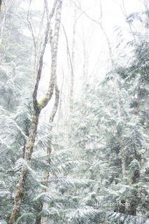
Knowing we had many miles to travel on our feet this summer, my sister and I began to train and get ourselves into condition. We brought along friends who we'd hope would be able to come with us on our traverses of the Olympic Mountains. One fine and beautiful day in March, just before the shut down orders, 5 of us hiked a favorite early season conditioning hike near Lake Cushman. The day was glorious as we set off up the trail. Sunlight streamed through the forest. As we climbed further into the forest and hills, a soft drizzle reminded us that it is spring in the Pacific Northwest. Soon small white flakes began drifting down through the forest. It was magical, just magical. I look at this photo and remember the wonders of nature and the comradery of friendship. 


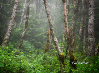
Ahh, Freedom at last! After what seemed like years under stay at home orders, we were able to hit the trails again. My sister and I started back into conditioning, but we had lost months and felt as if we were starting from square 1. One of our first hikes back was the Lower Big Quilcene River Trail to the old shelter site and back. Since it was a healthy Washington State spring, we hiked in light mist nearly the entire way. However, the day wasn't dark and dreary day - the trail was filled with a glowing light of spring growth and Pacific Rhododendrons. What I love about this scene is the simple reminder that the world is a beautiful place even in the most mundane scenes.


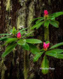
Speaking of Pacific Rhododendrons - I absolutely live spring in the Pacific Northwest when these pink beauties are blooming. They are the very essence of wild as they reach up through the dark forest - long gangly branches looking like a teenager performing stunts on a skateboard. The smooth green leaves contrast with rough furrowed bark of the surrounding trees. Pink blossoms contrast with the dark greens. my heart lifts when I see them. We hiked a favorite Rhodie hike during the peak season and I found these three blooms making a perfect equilateral triangle against the thick rough bark of a douglas-fir. 


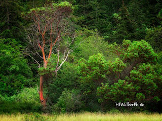
On Father's Day, my sister and I journeyed with our friend Holly to Fort Worden. It was her first Father's Day without her father. As we hiked through this large meadow before heading up to Battery Hill, I spied this fabulous Madrone tree at the edge of the forest. The red against the green made a striking image. But I also thought of my friend who was now several paces ahead and her striking resilience for all that she had experienced in her life. I do love Madrone trees for their ability to thrive in some of the harshest conditions. Holly has lived through personal and family tragedies and has come out stronger for herself and those who need her. I will forever see her in this image.


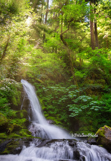
The first of our long treks was postponed due to COVID concerns. But we had to get out. My suggestion was to load up the dogs in Kristi's Jeep and find a dispersed camping site near Mt Rainier National Park. We found a not-so quite creek-side spot on Skate Creek Road and relaxed - soaking in the smells and sounds of nature. Always wanting to explore an area, we started to hike around where we camped and found this gorgeous waterfall. As I looked up, the sun broke through the clouds and trees for an epic image. I am reminded that when plans change, we can look somewhere else for an adventure.


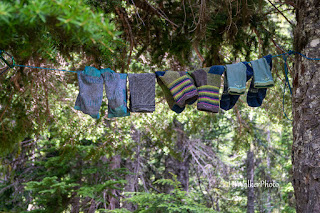
Just a clothesline with socks? To me this is much more. I have been wanting to explore the backcountry of Olympic National Park nearly all my life. I think I was about 8 when I met a woman who had hiked all the trails in the park. My eyes sparkled with the opportunity until my mother told me about the realities of such a venture. As an adult I re-awakened the dream. I had made a few backcountry incursions - a few miles over a weekend here and there. This? This was a 9-day adventure for me and my sis. We would travel up one river valley, sleep on a mountain ridge, see 4 bear, get soaked through and come out another river valley. We hung our socks up to dry (and air out) on day 6. It's a simple photo, but it is a reminder of the realities of such a venture and that dreams are still worth the effort.


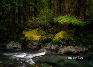
This was a year that I embraced forest photography. I embraced the gloom of grey days in the forest. I embraced looking for where the light enhanced the scene. I embraced composing for the light in the scene. With this image, I began to feel as if something was beginning to work. I felt myself become excited for the prospect of another long walk through the woods on a dark and grey day. I also thought this image summed up the year for me - it was a dark year full of anxieties and illness but light still shined through.


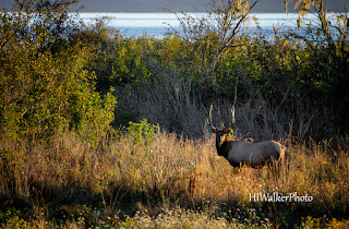
I had always heard of the Dosewallips elk herd but had never seen it. A trip to the park after a failed attempt at a thru-hike of the Olympics gave me the sight I had been hoping for. We checked into the park and I asked about the herd, if it had come into the lowlands yet. I was told that not only were they in the park but they cows had adopted a baby deer and were raising it. It was with hope of seeing this little adopted deer that sent me out early in the morning searching for the herd. I didn't have to look far and was soon watching them from the safety of a wildlife viewing platform. I did see the deer trotting along with the heard, but it was this image of the bull standing in the meadow at sunrise that made me swoon.


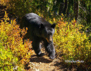
If safety was a concern with the elk herd, it was imperative with this guy. My sister and I saw 11 bear over the summer - 5 just on our trip to the High Divide in the Olympics. We set out on a long weekend with friends and were traversing the ridge on day 2 when this guy came rambling down the trail. We tried to remind him that it was our trail, but he reminded us that this was his home. He sauntered past us just feet away, stopping occasionally to nibble berries off the bushes. He's gorgeous. After he passed us, we high fived each other and yelled down the trail to warn the next group of hikers. My adrenaline and joy gushed the rest of the way to camp. 


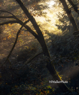
I love the simpleness of this image. I love how the shafts of sunlight warm the sky and caress the trunk at the bottom of the frame. I had been hoping all autumn for some foggy days and was rewarded on a trip with friends to Whatcom Falls Park in Bellingham. It was my first visit and while I loved the images of the falls, this image of light streaming through the trees made my heart sing. 


And if it's simpleness you want, what could be more simple the a single cobweb covered in dew stretching from dried buds and raindrops to  . . . well, who really cares? I found this on a day where the light in the forest made even the most mundane subject look special. In one small area, dew drops and cobwebs filled my camera's sensor and I was lost in the beauty of nothing.

I truly hope you enjoyed revisiting some of my favorite adventures and images of a year the was hard and joyous. Be well. Keep yourself and others safe. And here's to a better 2021. Heidi


Wednesday, April 15, 2020

Forest Photography


Forests can be difficult to photograph with harsh light streaming through the trees creating harsh shadows against brilliant highlights. Chaos reigns over simplicity where branches intersect, and textures vie for attention. They are busy places where the eye can find little rest. If the eye has difficulty finding rest, your camera lens as an extension of your eye will not find it. Finding a way to simplify your forest scenes becomes the task in forest photography.

Our brains like simplicity. When we look at an image, our brains like to be able to discern easily the subject and story the photographer finds important. Here are a few questions to ask yourself as you walk through a park woodland to help you find and compose an image filled with story without the clutter.

Who is your story about? In forest photography, it isn’t simply about finding a nice composition, it’s about finding the main character of your image. It could be a gnarly tree, or a fern resting in the roots of a cedar, or flowers along the path, or even how the sun lights the moss clinging to a branch. Find the character you want to feature in your image then look for compositional elements to highlight the character.

How’s the light? Look around you. Is the sun shining brightly casting dark shadows through the forest? Is it an overcast day where shadows and highlights are softer? Is it a dull day with barely any light seeping through the foliage? Each of these lighting situations bring with it their own challenges and rewards. Harsh shadows give your images a graphic quality that you can further accentuate by converting your image into black and white. Turn your back to the sun to find a composition that is completely lit from the front yet the background falls into shadow. These images are great to emphasize shapes and textures of branches and leaves. Even better, look for plants that are backlit and the background falls into shadow as they make beautiful and dramatic images. Bright overcast days make photographing forests easier as everything in the woodland density is more evenly lit. You still have shadows and highlights but not as dramatic. This lighting lends itself well to images of the personality of the forest; wider landscapes filled with trees and the ferns and bushes that fill the understory. The darkest days lend themselves well to small little vignettes of the shapes and textures of life. Find the little bright areas of leaves and flowers to focus on. Don’t stay home in the rain either. Throw on your macro lens or extension tubes to capture rain drops on leaves. Or capture the ethereal nature of rain in the forest as the air around you seems to moisten and soften. If you are lucky enough to have a foggy day in the forest, you will find other worldly images and subjects happily separated from the busy-ness of the background.

Will a different lens help? Different focal lengths of your lenses will give you flexibility in your compositions. As discussed earlier, landscape photographers rely on the holy trinity of zoom lenses – the ultra-wide angle, the mid-range, and the tele-photo. With these lenses you can capture all the moods of the forest. With the ultra-wide angle, you can capture environmental details and play with the curvature of the lens distortion. Try getting in close to a flower and have the forest in the background. With your mid-range lens you can capture all the scenes and details close to the trail. Your tele-photo zoom can isolate features and details farther away. Change out your lens to see if that helps you create the image you want.

What happens to the image if you open or close the aperture? The aperture, while regulating how much light reaches the sensor, will also determine how sharp the elements in front or behind your subject are. The aperture determines how thick your plane of focus us. The wider the aperture, the narrower your plane of focus and more elements behind and in front of the subject will be out of focus. The narrower the aperture, the thicker your plane of focus and more elements around your subject will be in focus. Try making several images each with a different aperture to see how that changes the mood of your image.

Is the shutter speed helping you capture or stop motion? In forest photography you might think that you’d want to show trees as steadfast and solid. Trees don’t move – they stay in one place from sapling to collapse. And that may just be the story you want to tell. But is it the only story? Watch trees and you will see them sway in the breeze, bobbing their heads to an unheard beat. So, play with the dichotomy of solid trees that shiver with the slightest caress of a breeze by slowing down your shutter speed and let tittering trees become the focus. Another fun exercise with slower shutter speeds is to use intentional camera movement to create abstract images of the forest.

Did you remember to bring your tripod and polarizing filter? Two indispensable accessories not to leave behind are your tripod and polarizing filter. I darker forests, when your shutter speed is slow, you will want your tripod to reduce camera shake. Avoid the disappointment of having spent the day in the forest photographing verdant beauty to get home to see unintentionally blurry photos. Use a tripod. The other accessory, the polarizing filter, comes in very handy in the forest to help reduce the glare of reflected light off leaves. Using a polarizer can help bring richer, more saturated color to your image by reducing the reflective glare.

Did you perform border patrol? Your final act before releasing the shutter is to perform border patrol. This is one of those tasks to undertake in all landscape photography. Border patrol is to check the edges of your image to make sure there are no distracting elements coming into the frame. This was once far more important in film photography since you can easily clone out distractions in your editing software. But it is a good habit to get into. Sometimes a gentle shift of camera position can take out the distraction without disturbing your composition eliminating the need to fix it in post. Also, fixing those distraction in forest photography can be cumbersome with different branches and leaves that may not clone out as well.

With practice, forest photography turns into joy and meditation. Spend time exploring the forest.

Monday, April 13, 2020

Thinking in Black and White


Way back in the mists of yesteryear as a young student in the world of photography, when we used film and processed our images in a wet darkroom, my first year was spent looking at the world devoid of color. My lessons revolved around black and white film, black and white paper, and black and white processes. The concept behind this learning process to look at the world through a colorless lens taught me to see a scene reduced to its base elements of light and shadow, shape and form, texture and emotion. The ever-present Zone System created by the king of Black & White photography Ansel Adams taught an awareness of light on the land and its effects on film and print. The monochromatic world became so ingrained in my psyche that when I excitedly processed my first color images, they appeared garish and unnatural. And the lessons I learned during those initial courses were forgotten for a short time as I explored a new color-filled world. I lost my black and white base as I transitioned into color – thinking the two ways of recording light had very little to do with each other.

I was wrong. Oh, how I was wrong.

The lessons I learned in those first classes had everything to do with color photography. Was there any wonder why my first images in color lacked the compositional qualities and emotion that I had been trained to search out? There shouldn’t have been. I was like a beginning crafter left unsupervised in Hobby Lobby. I ran through film creating colorful junk. The colors were pretty, but there was nothing I wanted to show others and far too many boring sunsets. It took me a while before I included first year lessons with second year projects. I had to go back to thinking in black and white to create images that would help me pass my classes.

They are lessons I will not forget and find useful from time to time when photographing for black and white and looking at scenes to photograph in color.


SIMPLIFIES THE SCENE

Strip the color from your image and you are left with only tones of grey. There are no distracting colors that direct your viewer’s eye from the subject. You end up relying primarily on the shape, texture and contrast to captivate your viewer. You strip your image down to its barest elements. Composition skills are brought to bear in black and white photography – you need to create compelling compositions in your images to help bring them to life or they become a mass of grey no matter how much contrast you add.


SHAPES YOUR SUBJECT

Photography is about recording light onto media – film, paper, or digital sensor. When you remove the color, all you really have left is light and shadow to shape the subject in your compositions. Our brains understand how light falls into shadow on curved objects and blocked objects and can discern between balls and bricks just by how light falls across them. You can use light and shadow to emphasize the shape and the shape then becomes as important to the subject as the subject itself. Also, you can simplify the scene to highlight only the shapes within the image.


ADDS DRAMA

Finally, you can highlight the mood, emotion, or texture of your subject. With no other distractions, your viewer can gain a greater sense of the ideas behind the image. Think of some of the most powerful portraits from the past. I always think if the images captured by Dorothea Lange during the depression. She was able to capture raw emotion in the simplest of images. “Migrant Mother” just is not the same image if I imagine it in color. Try it. Think of an image then imagine it in color. Does it feel the same? When you strip an image of color, you simplify the image to its basic shapes and its basic emotions.


TIMELESSNESS

There is also a timeless quality to black and white images. A quality that stretches back to the earliest days of photography and far into the future. Fads happen in color photography. We may not notice it much, but take a look at an image from the 70’s or 80’s. Not only do we know what decade it comes from because of the color palette of the day (avocado green and harvest gold anyone?) but there is a tonality to the image – a faded low contrast haze. But look at a black and white image from the 70’s and you may not recognize that it is from the 70’s – unless dad’s horn-rimmed glasses give it away. Because of this timeless quality, many photographers find that black and white photography lends itself well to fine art prints.

However, not every image translates well to B&W. Look for scenes that have a subject that conversion to black and white will help emphasize the subject. These are often subject that have a different color palette, texture, or lighting. Where the subject won’t get lost in grey. We are lucky in the digital age that we can convert an image to black and white to test it out and if we don’t like it – we can delete those layers. Converting to black and white will not save an image that is not exposed correctly or composed well. In fact, those flaws can be highlighted in black and white imagery

How to create your black and white image:

In camera: A lucky few of us have the ability to record only the reflected intensity with our digital cameras. Some cameras will record both a color version and a monochrome version. This helps when you are having difficulty determining if an image would look good in black and white. I personally like to make my conversions in Photoshop (or Lightroom).

In Computer: You can convert your images to black and white with any photo editing software. In the Adobe world (Photoshop and Lightroom) several companies also have plug-ins that will convert the image for you in different monochrome styles. Simple on-line tutorials will show you how to convert and adjust your image for any software you use.

Ideas for black and white images:

While not every image translates well to black and white, you can photograph everything in black and white.  Keep your eyes open for strong contrasts that highlight shapes. Making everyday objects into abstract images of light and shadow is a fun way to experiment and practice your techniques. Try long exposures or Intentional Camera Movement (where you purposefully move the camera during the exposure) for interesting abstract images. Photograph subjects with a lot of texture and highlight that texture with strong contrast. Find scenes that you want to simplify or highlight a particular subject.

Sunday, December 29, 2019

2019 Memories


It's hard to believe 2019 is ending and a new decade will be starting in less than a week. As I look back on this year, I marvel at everything that has happened. I started the year sharing a small cabin with family and friends in a remote corner of Washington State. Through this year I was able to share with 3 different groups my future books (no they are not done yet, but getting closer) and inspired a few to head out to explore on their own. I even submitted the book proposal to a publisher - fingers crossed. I was asked to present a talk at a local photo conference about personal projects and I think I found my signature talk - if I ever get invited to speak again. Mid-year I started vlogging and have learned so much about video recording and editing and even about accepting myself. I have even started working on a better business plan to coach photography and public speaking for photographers. Adventures have been amazing with 2 backpacking trips in the Olympic rainforest, several day hikes and road trips and finally a grand adventure in the Canadian Rockies. This has been a very good year and trying to choose my favorite images has been extremely difficult. Can't say these are my absolute faves from the year, but they help make the year memorable.


This first one may seem a bit odd for a landscape photographer - a city scape of pigeons flying into the air. But I love street photography as a way to challenge myself - to look at the cityscapes and find the beauty there in the buildings and the people. Our everyday interactions with our environment may seem mundane and boring, but really, are they. Stop and look around you to find the patterns in the construction, the nature finding a way to thrive, the humanness of an interaction. I was in Denver in February for a work conference. My last morning there, I decided that instead of meeting my coworkers for breakfast I'd walk around downtown with my camera. It had been 20 years since I left Denver and enjoyed walking along on streets familiar yet strange. This empty lot had a flock of pigeons pecking through the snow for treats and I accidently disturbed them. Not quite ready, I still managed to grab a couple of images of the birds lit from above and below.


It's all about the viewpoint. While camping at Mt Rainier National Park this past summer, I decided to take an evening hike to a waterfall close to camp. I had been there several times before and wasn't sure if I'd be able to create anything. By the time I got to the falls, it was just too dark to really look for a composition. Luckily I had spotted this little trailside waterfall on my way. There was something about the how it fell through the mossy rocks down the hill that said I needed to take my time with the composition to show the drama of this little falls dwarfed as it was in the expanse of the forest. This perspective of looking straight down helps create that drama.


One thing is true about the temperate rainforest on the Olympic Peninsula, life grows where ever it can. On one of my backpacking trips to the rain forest this past spring, I saw this little batch of Bunchberry Dogwood growing in a crevice of this Sitka Spruce - at eye level. Of course I had to photograph it. It is the essence of the story of the Olympic rainforest - that life will find a way to take root and thrive. I love the simplicity and resilience of the little woodland ground cover. The bright white flowers sparkle as 4-petal gems along the forest floor beneath grand stately trees - or, in this case, on the trees. The leaves have beautiful lines that turn gold then red in the autumn. The flowers give way to 3-berry bunches bright red berries. This little plant was growing perfectly placed to offer a cheery hello as we hiked by.


Envy is a powerful emotion. So reviled, it is listed as one of the 7 deadly sins in the bible. But there are 2 sides to envy. The first is the one listed in the bible. The one that eats at you and makes you angry and hurtful. The second makes you strive for better in yourself. This is an image that reflects both of those sides for me. I used to not want to watch YouTube videos of other photographers or read their personal blogs because I was envious of their journeys - both in the world and photography. I wanted what they had and it made me bitter and angry. I always felt as if I was trying to play catch-up with what everyone else was doing. I grew resentful when I saw other photographers capture the images I wanted especially if they had the free time to chase the image - I was stuck at work. Then I found a couple of photographers on YouTube that made me smile and want to do better. Listening to them helped me listen to myself. It helped to remind me that I have my own vision. This image is a result of listening to them and listening to myself, of taking a chance, of not always needing to pursue that big vista wow-factor. A reminder to be me. Thank you YouTube dudes and dudettes.


This is another reminder to be me - although this image is an accident. I have been trying for years to capture the iconic image of Cape Disappointment lighthouse with waves crashing high on the cliffs below. They are amazing images and honestly, I wanted to play with the big boys. I wanted to prove that I too had the ability to capture those images. So I traveled to Cape Disappointment for Christmas because the tides were going to be pretty high and there was a possibility of the crashing waves. But I felt like a hypocrite. I advocate for the smaller places on the planet - that they are photographic destinations no matter how small and that non-iconic images should be created in those places and the larger places. Yet here I was chasing an iconic image. I got the image. Then this happened - while using auto-focus, I focused on the lighthouse which is about a half mile away with a large splashing rock between me & the cliff. Between me and the water was about 20 feet of piled driftwood that waves crashed on. Just as I released the shutter for the wave in back, a wave crashed on the pile of driftwood and magic happened. Funny how magic happens when I go on a photo trip for Christmas.


Don't forget to look at the details. It was still early in the summer as I walked through Billy Frank Nisqually National Wildlife Refuge. Being summer and the world around me filled with rich tones of green the red of these leave drew my attention away from the mossy greens nearby. I was composing an image when the corner of my eye saw something else that seemed out of place - this little green tree frog. "Why yes, of course I will make your portrait little frog."


I had traveled down to the Lewis River in the Gifford Pinchot National Forest for a hike with friends. I was there early having driven down the night before and decided to explore the Lower Lewis River Falls. The light was with low clouds obscuring the sky and created a few images that I was happy with before going back to the car to wait for my friends. Once they got there, we headed back down to the falls before starting on our hike. Just as we were about to leave the clouds broke apart and the sun streamed through through the trees to highlight the falls and one little tree. Drama unfolded before my camera lens and it stays as a reminder of a wonderful day hiking with friends.


This is the first image on my list from my trip to the Canadian Rockies. I went with a group of other photographers for 10 days of exploring and photographing an area I often visited as a child with my family. Our last night in the area, a couple of us went back to a reliable location just outside of Banff township - Vermillion Lakes with an amazing view of Mount Rundle. As I sorted through the thousands of images I came home with, I couldn't stop looking at this image. It's a simple image but everything came together so well in it. The mirrored shapes between the grass in the foreground, water in the midground, and Mount Rundle create balance and symmetry. Then there is the drama between the light, golden clouds on the left and the dark, dramatic clouds on the right. This brings all the joy of the trip back to mind for me.


Another image from my trip to the Canadian Rockies - this time from Jasper National Park. My dad loved Jasper. So much that he often talked about moving here and never coming back. He never did, but our family spent many a vacation here watching bears, photographing mountains, and drinking out of clear streams. On these trips, mom would have one request - to be dropped off at the side of a lake to fish the day away. Dad would leave her on the side of the lake with her rod and a cooler filled with soda and take us girls for a hike.This was one of mom's favorite lakes as they shared the same name - Patricia. We got to the lake late in the day with not much time to explore and as the light began to fade we stumbled across this little scene. For me, it's the perfect way to commemorate my mother's love of fishing on this lake.


Like street photography, dance photography helps to push my boundaries and lets me explore a photography style I normally wouldn't pursue. I discovered an excitement within myself as I began to capture images of dancers gracefully showing their talents. This warm spring day a small group of dancers gathered for a larger group of photographers at Seattle's Gas Works Park for an afternoon of dancing, posing, and friendship. This image stuck out for me since I was able to capture the dancer in mid-leap with Seattle in the background and the effortless look on his face - as if this is just they way he moves through the world.


Another image from the Canadian Rockies (there were so many happy images from that trip). This is one of those images that came together perfectly. I convinced my friend to pull into this rest area/boat launch for the Athabasca River just south of Jasper township because I saw a bull elk in the woods. As people started gathering around the herd of cows close to the river, I thought I should give the herd some space and walked down the river bank a bit. I began photographing the cows as they contemplated swimming the river. Then the bull walked out of the woods onto that little spit of land to watch over them. It was the perfect moment with the herd framing the bull. A few minutes later, the herd began swimming across the river followed by the bull and the moment was over.


The last image in this list is one that is truly special for me. My mother loved owls. Every time I see one, I am reminded of her and feel her close to me. I meandered through the forest at Birch Bay State Park photographing another love of hers - wildflowers on the forest floor. I paused a moment and looked up to see this little Barred Owl watching my progress along the trail. It sat still for a few moments before silently flying to another tree. There was beauty in that moment - a connection between myself, nature, and a memory of love. And a perfect image to say farewell to this fantastic year and welcome the next adventurous year. 

May your new year be filled with adventure, beauty, and self-discovery.

Saturday, December 14, 2019

Storytelling and Composition


Pull up a photographer’s YouTube video on composition or read one of a myriad of composition articles and you will be told that a good photograph tells a story. They each give you advice on how to compose your image to tell that story. What is the story you’re trying to tell? Tell the story. Tell your story. Tell a story.

They are not wrong.

But I want to flip this narrative a bit. How about we look at this from another direction. Not from looking at story through photography but looking at photographic composition through story design.

We’re going to be talking theory here to help you frame this concept better. If you want to understand mechanics better, I’ve written a 3-part series on some of the more helpful “rules.” (part 1, part 2, part 3) You might even want to check out part 4 about listening to the scene and telling its story.
You might also want to grab a cup of coffee.

For a brief review, what is composition? It is the structure within your photograph that helps tell a story. It is the order we align the elements in our image to help the viewer comfortably work their way through the image. In writing, we put our stories into structures to create a picture. Our story structures can be immense such as a novel, condensed as in short stories, or concise as in flash fiction.

Let’s look at these more closely and how these structures relate to photography.


The Novel and The Grand Landscape

A novel is a story that is long and complex. Often with several characters and subplots within the main structure of the story. Within the pages of the novel, the characters are developed and have story arcs, we get to know them as friends - celebrate when their lives are going well and cry when they die. The plot and subplots move the reader forward through to the end – we read into the dark hours of morning unable to put the book away, needing to know what happens on the next page. A well-written novel will have layers of meaning that ensnare the reader who days later will be examining the world through the view of the author no matter how distorted or perfect that view is. We yearn for the characters to come to life so we can spend more time with them.

How does this relate to a photograph? Think of your grand landscapes – those landscapes where you are standing at a vista and looking at the world as it unfolds before you. You’re at the edge of a canyon, layers of earth worn away by the river shimmering in the depths of shadow. Or maybe your view is from a cliff overlooking the ocean, waves upon waves undulating to the horizon. Or you come through a thick forest to a precipice and you see before you repeating layers of mountain ridges and peaks leading off to a massive volcano in the distance. What initially draws your eye becomes the main character which then becomes the focal point of your image. The other elements of the image become subplots and minor characters to move the reader through the main plot. Each a layer that enraptures your viewer leads them through the image to become as enthralled with the view as you were. They find it difficult to tear themselves away.

In the photo above, I stood on the side of the road through an area of Eastern Washington on hills high above the Snake River. I could see the hills on the other side of the north end of Hell’s Canyon. This is farming country. This is lonely country. Every time I drive this stretch of road, this barn whispers to me. On this early summer day, it yelled with joy. The barn is clearly the subject of the image – the protagonist of the story. The sky, the sun beams, the hills, the wheat field, the lines of trees in the distance, the hues of light and dark in the clouds, the splashes of sunlight on the hillside. All of these are added elements to help tell the grand tale of this lonely barn on this stormy day. Cropping out these elements and only featuring the barn wouldn’t help tell the story that needed to be told.


The Short Story and The Intimate Landscape

A short story is a fully developed story similar to a novel but much shorter, as the name implies. You will likely only find one primary character and few other characters. The characters, since they don’t have the benefit of many pages for development, become well-known acquaintances – someone you’d meet for coffee a couple of times a year to catch up. Generally, you will read only one plot as the limit on exposition restricts what the author will be able to explore. They are examining the main character in a short timeframe in a limited setting. The subplots, if there are any, cannot distract from the main plot of the story and confuse the reader. In a short story we examine a character and setting that is far more intimate than the novel. At the end of a well-written short story, the reader will feel as satisfied with the outcome as they will feel after a well-cooked meal. We might like to continue reading, but again while the characters and their stories are known to us, they’re not great friends who we end up missing when they are gone.

As we look at the intimate landscape, we can easily see the similarities. We are examining the world through a more intimate view. Like the short story will have a character that we come to know with a developed plot or storyline. We might see an expansive oak in the forest and create our composition with the oak as the main character. All other trees in the forest would be the storyline, the other characters helping to tell the story of the oak. Or does that oak preside over a lonely landscape where the negative space of sky and meadow help tell of its isolation? We won’t be seeing the expanse of the grand view, but the details of a scene that becomes more personal – almost as if we were a part of the scene itself. It is a self-contained image that tells the story of our subject, without extraneous details.

The little cabin above (can we call it a cabin and not a shack?) is a perfect example of the short story as an intimate landscape. We see our main character in a struggle against the elements as rain pummels the decaying wood. We know that this little cabin has already seen hard times with planks missing and its leaning stature. We know all we really need to know of its environment and the toll it has taken on the cabin. We know it has a history, even if the details of that history are not examined. We grow to like this little cabin. We wish it well and hope to see it again one day . . . maybe.


Flash Fiction and The Vignette of Nature

If you have never read Flash Fiction (where have you been?) then know that it is an extremely short story of less than 2000 words. Because is it so short, the author must grab you quickly to immerse you into the world they’ve created in short order. And that’s a pretty good definition – authors of flash fiction are the gourmet short order cooks of writing. They sit you down at the table, serve you a tale that is often a snippet in the life of their character then whisk away the plates. As a reader you are often left with wanting more but realizing that you really don’t need more, you are sated. Just like any story there is a character or more involved in a plot line. But the amount of information we are given is all that we really need.

When we move to comparing this to landscape photography, we see it as the natural vignette – a small portion of the landscape that tells an interesting story. Maybe it’s a group of woodland wildflowers twisted together in a fight for sunlight. A grouping of seashells on a beach tells us all we need to know about those seashells at that point in time. I’m mixing metaphors here but think of it at a scene in shorthand. Just enough to tell the story without writing it out in cursive. Think details. As photographers, we find those details that tell a wonderful story of the landscape as a whole. Our viewer may want to see more but leaves sated.

When we look for story-telling details, we see images as the example here. As viewers, we understand that there is more beyond the frame of the image, but that doesn’t matter. The captivating story is within this section of old wood on the side of the building where someone added a decorative touch of rustic Americana in the form of hub caps and wheel rims to the wall. We get one glimpse of the world beyond in the reflective wheel cover on the right. You have time to appreciate the scene. You may wonder about the person who hung the hub caps yet understand that really this is all you will get and all you really need. The image and story within it are concise.

So, how do you use these ideas in composition?

When you arrive at a location, look for each type of storytelling. Look for the novel or grand landscape allowing your viewer to experience a world of characters, and plot points all culminating in one climatic ending. Find the short stories or intimate landscape to give your viewer a personal view of the area, one where they get to know one character well and follow them through to a conclusion. Then finally search out those compelling details for some flash fiction or natural vignette. Combine all three of these at a location and you will come away with a strong body of work that will sustain your story and the story of place.

Friday, October 25, 2019

Telling the Story in Composition


Composition is a wondrous thing, filled with rules, guidelines and mystery. A good composition can make the boring scene exciting. On the flip side, a bad composition can destroy a beautiful scene. Composition can draw the viewer into your story but can also send them running in the other direction. We can talk for hours, and I have, on the rules of composition. (You can check out part 1, part 2, and part 3 of composition on my blog.)  We can analyze the interactions of leading lines and the Rule of Thirds. We can measure distances of the Golden Mean. We can judge an image on the photographer’s use of foreground, middle ground, and background. We can weigh the virtues of symmetry, balance, and minimalism. These are all concepts that a photographer needs to know, understand, implement, and toss aside when needed. Yet, if you follow these rules and guidelines, you could still produce an image that is lifeless and will remain on your computer and never get elevated to your wall, where good photos are meant to be.

Let’s chat a bit about going beyond the basics of composition. When you arrive on scene with beauty surrounding you and all these composition concepts in your head, do you freeze? Do you find it difficult to find a compelling composition? Do you just start pointing our camera in whatever direction and hope something will stick? Do you understand the guidelines of composition but have difficulty recording them on your sensor? Do you ever review your images after a trip and wonder what happened to the grandeur you experienced?

If you have answered Yes to any of these questions, allow me to help. As Erin Babnik explains, as landscape photographers it’s our job to organize nature. Composition guidelines help us to organize nature in an even more eye-pleasing quality that our brains can understand and latch onto. Look at the image above – the actual scene is one of chaos as forests in the Pacific Northwest are and the viewpoint is a bit disconcerting. Yet with the leading line of the waterfall through the mossy rocks, your brain knows what it is supposed to look at and finds peace in that implicit knowledge. That’s what composition is meant to do.

As you arrive on the scene, ask yourself these questions:

What attracts me to this scene? What do you like about the scene? What made you stop your walk or the car and take a longer look? Is it how the light plays across the scene? Do you find a pattern that is appealing? Analyze why – even before taking out the camera. I will often stand on a viewpoint and soak in the landscape before me without raising the camera to my eye. I am looking for those elements of the scene that attract me – and there is no right or wrong answer. Take 10 photographers to the same location and they will create 10 different images. Your vision is your own and if you like that rock, then include that in your photo or make it the subject. It’s answering the question “what about that rock do you like?” And you photograph should answer that question because you are now telling the story of that rock.

I was reminded of this basic concept of composition in a book about writing, because creativity is creativity no matter the medium. In her book “Bird by Bird”, Anne Lamont describes a scene from Mel Brooks’ movie “The 2,000-Year-Old Man” (a movie I have yet to see, but now thinking it needs to go on my list) where a psychiatrist gives advice to his patient about letting the broccoli tell him how to eat it. Sounds weird, right? But not. The subject, the scene you want to photograph has a way of talking to you; telling you how best to photograph it at that time with those conditions. What made you stop and look at the scene in the first place is a whisper. Each photographer will hear a different whisper and will photograph to tell a different story. No not a different story, just a different version of the same story, to contribute to a greater understanding of the subject.

Not every photographer will be compelled to tell the same story and that is what makes photography such a rich and creative endeavor. British landscape photographer and YouTuber, Thomas Heaton describes this concept further in his video about photographing one of the most iconic landscapes of the Southwest United States – Mesa Arch. Photographers were lined up to photograph the arch as the sun rose which makes the underside of the arch glow. However, because of the overcast sky on that day, the scene required a different telling. Thomas and a few of his fellow photographers followed the whispers and found scenes that created beautiful images of the same landscape. They were able to add to the story that is Mesa Arch by not photographing the arch itself but the landscape around the arch.

Now this is where the going gets tough – set up your camera and start removing everything in the frame that doesn’t help tell your story. A common thread to photography is that while painters start with a blank canvas; the writer begins with a blank page - our canvas, our page comes pre-filled with extraneous bits and pieces and it is up to us edit out elements to create a compelling image – an image that narrates the story of this place. It’s tough. I know when I get to a beautiful alpine meadow and flowers paint the landscape in a rainbow of hues, I want to photograph all the pretties. I want to include EVERYTHING. And I bet you also have that same impulse. You get to the viewpoint and want to get it all in the frame of your camera, but then seem unsatisfied that you couldn’t record the grandeur of the view.

Have you ever uttered this statement? “The camera didn’t do the view justice.” That’s because you’re not being choosey about what to include and what to exclude. Going back to writing, there’s a saying in editing that you have to kill the darlings. You might have a phrase, a sentence, or even a character that you love – that makes you feel good about yourself and your abilities. But sadly, this element doesn’t work in the grand scheme of the story. It’s one of the hardest things for a writer to remove that piece. It can be that way with photography too. We love that little element off to the side, but it becomes distracting to the rest of the image. Crop it out. It helps to stop and listen to the scene, breath and watch, then start looking through the viewfinder without the tripod if you’re using one. Find the view and composition where that whisper you heard turns into a yelp of joy.

Say you’re at an overlook at the Grand Canyon. Of course, you want an image of the canyon with all the layers and textures of the earth. You frame up an image that encompasses as much as you can to show the grandeur. While you’re at it, you try to include a little promontory closer to you, but then something just doesn’t look right. At this point try one of two things. Crop the promontory out of the frame, then reposition yourself, investigate the promontory and create another image. Or ditch the first composition, move yourself and reframe an image that features both the promontory and the grandeur. That little promontory is trying to tell you something about the story of the place. Listen to it. I think you’ll be happy that you did.

We can know the rules or guidelines front to back and create technically correct images that never spark life in our audience. To take that extra step to listen to the needs of the scene and find the telling of the story of the time and place and only telling one story at a time, eliminating all of the extraneous side stories, you will be well on your way to creating an image that calls to your audience to stop and listen to the story you’re retelling.

Sunday, October 20, 2019

Ideas of Composition: Part 3


Welcome back to my blog series on composition. We are now on Part 3. Part 1 explored Rule of Thirds, Symmetry and Balance, and Leading Lines. Part 2 explored Curves, Rhythm and Pattern, and Framing. So many ideas to help make your images better. But wait! There's more! In Part 3 we will explore the ideas of  Foreground, Midground and Background, Shapes, and Filling the Frame.

Again, these are ideas to build upon. The ideas in the previous blogs work well in exploring these ideas

FOREGROUND, MIDGROUND, and BACKGROUND


Photographs are two-dimensional representations of our three-dimensional world. How do we compose images that help translate that three-dimensionality onto a two-dimension medium? Through our compositions, we create the illusion that the two-dimensional image is three dimensions with the use of foreground, midground, and background. Adding these elements helps to create the appearance  of depth by giving the viewer elements through the image to focus on - just as we would have elements close to us, between us and the distance and into the horizon in the world around us. Let's look at these one by one.

Foreground brings the viewer into the image and creates interest to investigate further. This is usually a detail closer to the photographer that is interesting and will make the viewer pause to admire it's interesting lines and details. It often helps set the stage for the rest of the image. A colorful bush in the fall or a patch of flowers in the spring tell the viewer the season. A country road leading the eye further or a ramshackle fence tell the viewer we are no longer in the city. Take your time in finding an interesting foreground - your midground might change but your background will likely be far enough away to change hardly at all. A viewer can tell whether or not you took your time here - throwing in a foreground just because you want a foreground will do the exact opposite of what you want. It could look haphazard and the viewer will walk away. Foreground can be the base of the rest of your image and when done right will direct the viewer to the rest of the image.

Midground helps draw the viewer in further, and is often a resting place for the viewer's eyes. The midground should be free of distractions or elements that either block the viewer from continuing on into the image or distractions that draw them away from the image such as a fence that reaches from edge to edge where a viewer feels blocked out of the image or a road that continues out of the frame and the viewer's eye goes with it. Sometimes this is where we find our subject. Think of an environmental portrait where your subject has an interesting foreground that possibly frames you subject and the subject with a background as a backdrop. Often your midground is your most versatile area in your photograph and should never be neglected.

Background is often the culmination of the journey in the photograph - the fulfillment of the viewer's interest. It can be the subject such as a magnificent mountain in grand landscapes where the viewer feels as if they have been on a grand adventure. Most often though, as the name implies, it becomes the backdrop to what is in the midground or foreground. When used as a backdrop, you'll need to take care of not including distracting elements such as a branch impaling your subject's head or bright highlights that lead the eye away from your subject. A good background keeps your viewer's attention in your photo for as long as possible.

Can you create interesting and compelling images without all three of these? Of course you can. This is another way to create compelling images that draw your viewer into the story your trying to tell.


SHAPES


We're going back to geometry class here for a minute and combining it with a bit of psychology. Sounds fun doesn't it?

Our brains need to organize the world in categories to help it make sense of the world. It becomes a sort of shorthand for the mind. We see a door and we know two things immediately - it is an egress and it is a rectangle. From there we build on the style of door, where it is located, and all sorts of things. But our immediate lizard-brain response is rectangle and escape.

Using shape is one of many ways we organize the world to help our lizard-brains understand what is going on around us. We see parallel lines on the ground and without having to think much we know that it is a pathway - the beginning of a journey (probably why I love leading lines so much in my images). We can strip our images down to the most elemental and create images based on shapes. We can look for triangles and curves/circles to add a sense of motion for our lizard-brains. Rectangles and squares add stability and safety.

How does this apply to composition? Well, think of the base elements of the story you're trying to tell. Is it a story of action? Then you will want to avoid creating and photographing squares and rectangles, instead you'll want to look for rectangles and curves in your elements. Do you want to tell the story of safety and security? Now would be the time to look for rectangles and squares.

So what's up with the image above that includes curves and squares? Let me explain it this way - our history is who we are, it is the foundation of our present, but time forever moves and builds upon our foundation.

FILL THE FRAME


Filling the Frame is a concept I heard often in my college days of studying photography. Back then, we used a substance called film and often could not crop our images especially if we were using transparency or slide film. So we needed to find the essential elements withing our composition and fill the frame with those elements and only those elements. We needed to conduct "border patrol" - checking the edges of your images to make sure you weren't cutting off anything essential and/or allowing anything distracting to encroach on your image. If there was, you'd need to re-compose. It is still a very good idea to conduct "border patrol" before releasing the shutter so that you aren't including distractions or excluding storytelling elements. Using film required us to analyze our composition and the story we were trying to tell and not include anything that was extraneous.

Filling the Frame was usually where I had the most difficulty in school. I often took the idea too literally and would fill my frame with the subject and only the subject often leaving out the most important element of the image - the storytelling quality that brilliant photographers understand. It about what story there is to be told and how you tell the story. So, filling the frame does not necessarily mean to fill the frame with your subject, but to fill it with the story, the feeling, the idea.

In the image of the ballerina, I was looking at a contemplative moment of the dancer resting between moves and poses. A quiet moment with her in her thoughts and studio. If I had moved closer to her, to fill my frame with the ballerina, it would not convey the same story - a story of quiet respite.

As you compose your images, think about the story to be told. Once you understand the story, fill your frame with only the elements that tell the story - nothing more and nothing less.